Designer - Front-End Developer
CTH Awards WordPress Website
A Modern, Responsive Website for the non-profit organisation
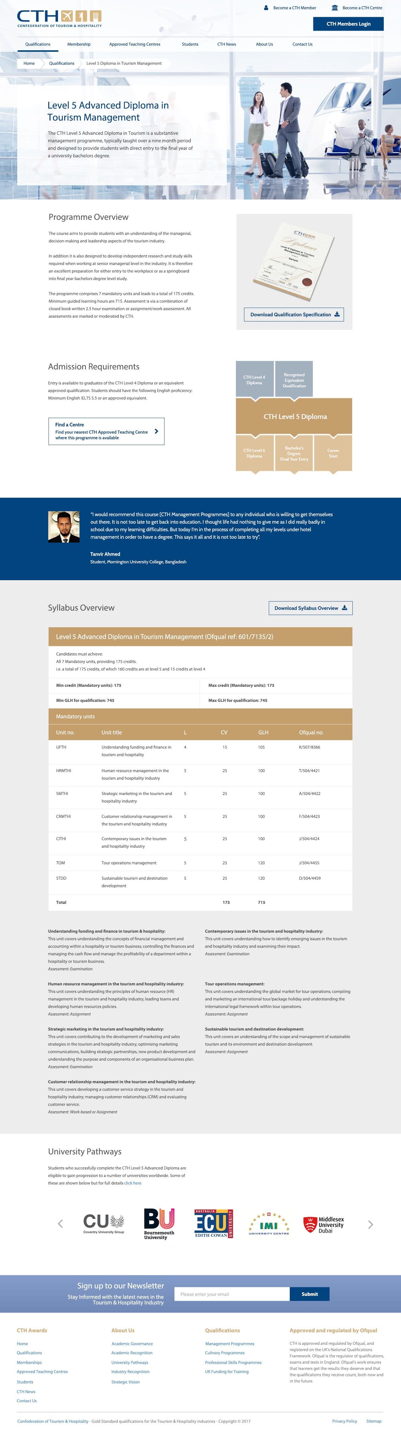
I was employed by the Confederation of Tourism & Hospitality (CTH) in London to redesign and rebuild their new website in WordPress. The goal was to modernize their digital presence, improve usability for both students and partners, and create a flexible WordPress theme that would allow their team to manage content with ease.
My Role:
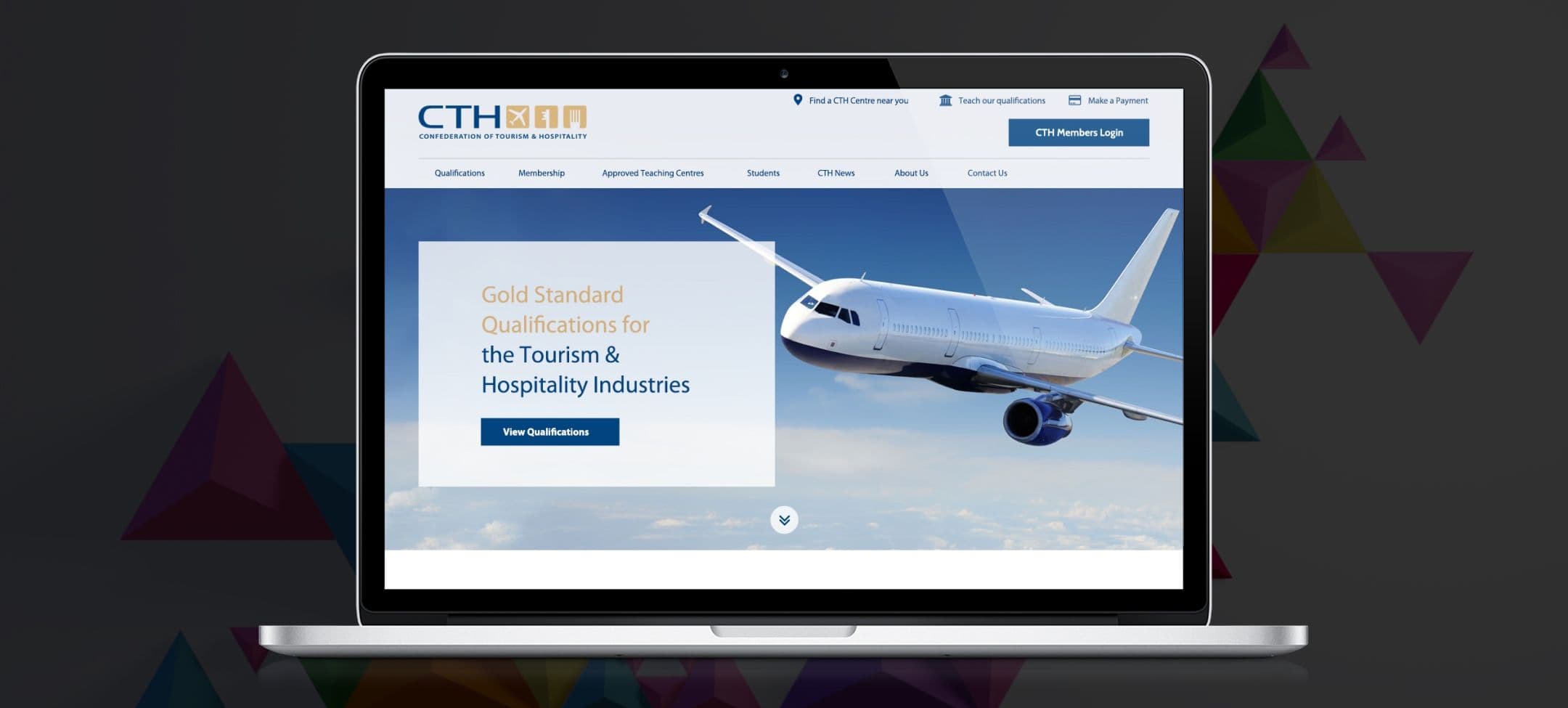
- UX/UI design aligned with their brand.
- Typography and colour design implementation.
- Responsive Wordpress development.
- Component-based page templates.
- Performance and SEO implementation.
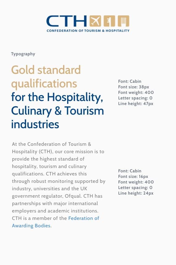
Using the Cabin typeface specified in the brand guidelines, I carefully defined the exact font sizes and line heights that would create a strong visual hierarchy across the site. This helped improve content clarity and ensure consistency across all pages.
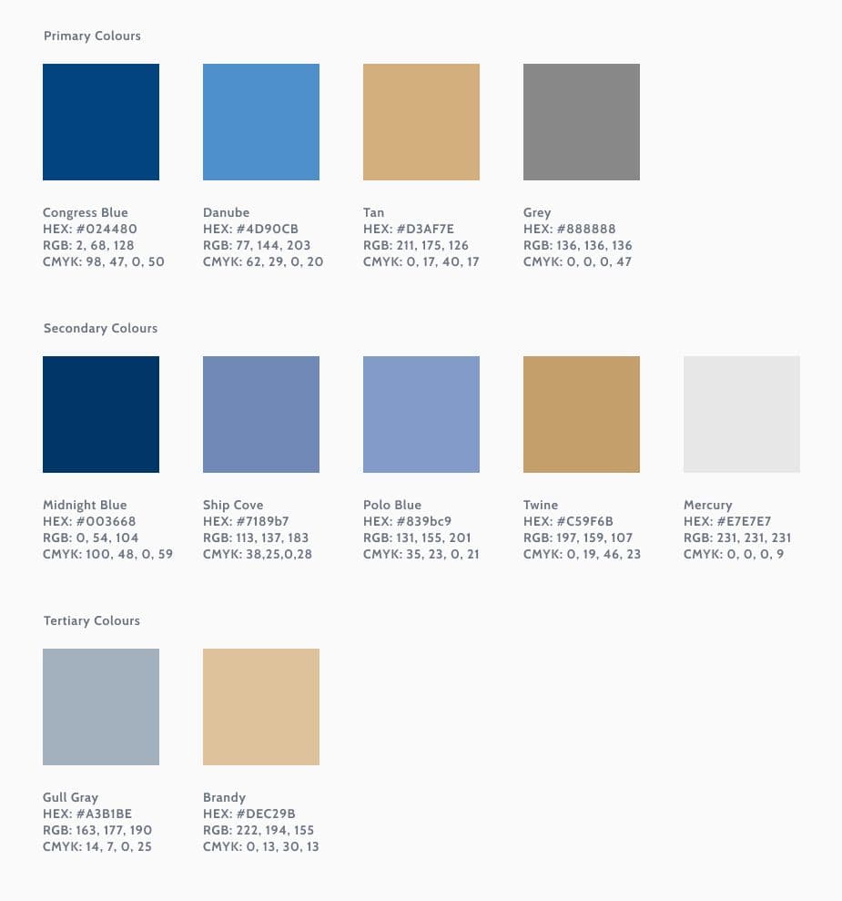
Colour Design System
To ensure the new CTH website communicated the organisation's professional, academic and international identity, I developed a structured colour design system based on their official brand palette. The goal was to create a visual language that feels trustworthy, modern and consistent across all digital touchpoints.
The core primary colours (Congress Blue, Danube, Tan, and Grey) form the foundation of the site's visual hierarchy. These tones were used strategically to emphasise key content.
The secondary palette introduced extended tonal variations such as Midnight Blue, Ship Cove, Polo Blue, Twine, and Mercury. I used these colours to add depth to the interface.
To support more delicate images and UI components, I incorporated the tertiary colours (Gull Gray and Brandy). They played an important role in creating calm and visually balanced layouts.
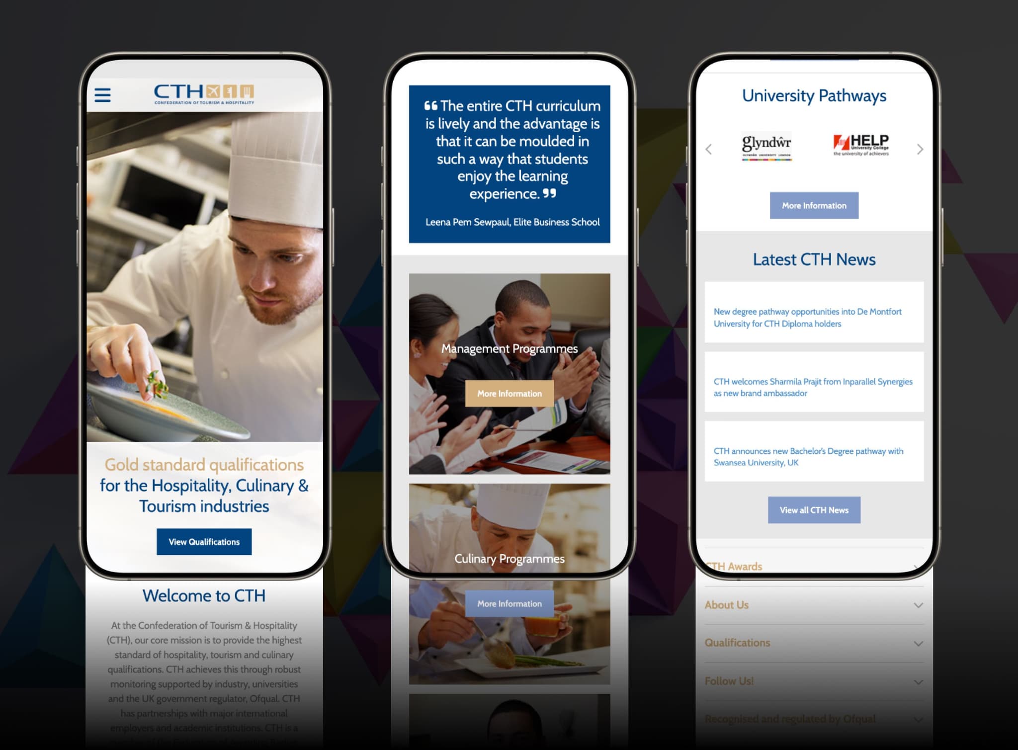
Responsive Design & Mobile Experience
A significant part of the CTH website redesign was creating a fully responsive, mobile-first experience that works seamlessly across all devices. With a large portion of CTH’s audience accessing information on phones, including international students, partner institutions and training providers, it was essential to ensure clarity, accessibility and smooth navigation on smaller screens.
I designed the entire interface with a mobile-first approach. The example screens show how key homepage sections were adapted to provide an intuitive browsing experience.